ClearScore has evolved from offering a free credit score and credit report to a small UK-based customer base in 2015 to serving over 20 million customer across three countries by 2021. The initiative aimed to optimise the core product experience, resulting in a scalable and consistent experience that helps people navigate diverse credit-related choices effectively
My role
As the design lead, I led a team of 12, comprising a content designer, 10 engineers, and a product manager. I was responsible for redesign of the core experience and UI design for native and web, overseeing the project from kickoff to launch and through multiple iterations.
Help people have a better understanding of their financial situation
Clear and actionable next best actions people can take
Desired user outcomes
80% of MAUs saw at least one personalised insight/action/offers on their Home feed
+22% increase in offer views from Home
+57% increase in conversion rate to other product areas
Results
iOS
Android
Web
Platforms
ClearScore has gone from a single-product domestic business to a multi-product international company, so new features and products needed to be represented. In addition, conversion and usability opportunities need to be acted upon.
The challenge
The evolved home experience required to be more intuitive to help users manage their credit regularly by giving them the timely insights they need to make informed positive choices, guiding them on their journey to improve in a meaningful way. It should provide new value on every visit to ClearScore
Before diving into design, I took a retrospective journey through ClearScore's interface evolution over the years. This exercise helped me gain deeper insight into the current interface's evolution.
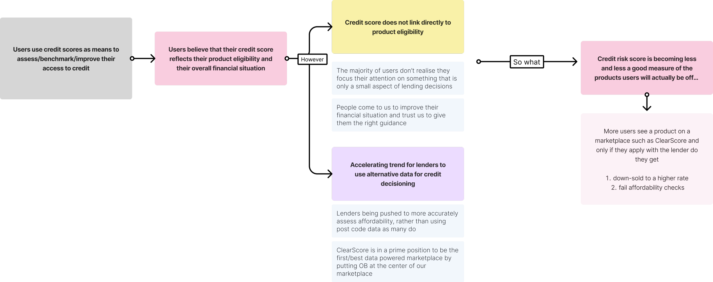
After this, I began by digging into our historical data, surfacing user pain points and barriers to conversion. Users commonly went from the dashboard directly to their reports. Despite surfacing in-depth information, the dashboard lacked critical usability (e.g. score changes, offers merchandising).
Qualitative data collection
User research played a pivotal role in this project. Given the intricate nature of the various insights and their interactions, it was essential to meticulously lay out all the details.
To accomplish this, our initial step involved gathering insights directly from end-users to grasp the challenges they encountered and how they perceived the product's ability to alleviate these pain points. Subsequently, we organized small, targeted sessions for testing, focusing on content iterations and incremental improvements.
💡Key findings
Access to more in-depth information upon landing.
Clear and legible content, indicating a need for improved accessibility
A prioritized hierarchy of information for better organization
Intuitive navigation, highlighting the need for optimization
Conventional interaction and feedback patterns, including scrolling behavior, button size, clickable areas, selected states, focus states, and visited states
A consistent look and feel across all three platforms
This demand stemmed from the perception that the existing experience was static and generic, leading users to perceive limited value beyond checking their credit score and report when returning to ClearScore.
Market research 2021
As the density of online content increases and people are overloaded with choices, the ability to find and access content across a myriad of services is crucial to the success of the experience
This project drastically affected multiple different areas of the organisation, which at times had conflicting interests. Therefore, we conducted interviews with representatives from Product, Marketing, Commercial, Support, and Executive Leadership to understand each part of the company's unique requirements and concerns for the design.
🤹 Balancing user needs with business goals
We've collected a lot of internal feedback, cross-referenced it with user feedback, and prioritised design solutions going forward. Also critical to our research process was to gather unsolicited feedback as people regularly shared these through tweets, support emails and calls.
Shaping opportunities
Our hypothesis: We believe by tailoring journeys to meet our customers needs, we will increase the average frequency of visits to ClearScore. This will lead to higher user satisfaction and loyalty, which in turn will lead us to obtaining a higher share of wallet.
How do we know we were successful?
Once we had a solid direction for the design, we began to produce multiple different variations of wireframes to then those in front of users and internal stakeholders for testing and feedback. This helped us to narrow the design down to three major variations, which I used to establish a single design framework, and thus move into visual design.
We experimented with a wide array of designs, eventually landing on an insight led feed structure. (3a below)
The new design approach needed to be scalable, flexible, and alive. This is one of the primary reasons why we went with such a grid-based, modular structure. It would scale well across devices, content could easily be changed or moved around, and key sections could be updated using a new editorial calendar that we would be introducing.
Inspiring confidence on Home
Every time people log in, they get a snapshot of what's most important to them in 30-60 seconds. They see only see the most actionable insights and offers, promos and marketing content most relevant to them.
Guiding principle
By surfacing the right content to the right user at the right time, we will generate higher regular engagement from ClearScore’s user base, (measured by higher average monthly visits to ClearScore), which in turn will lead us to obtaining a higher share of our users’ wallets.
Through user interviews and crunching analytics we discovered users actually used Home mainly to access their most relevant insights and offers…which the old design was burying behind a slider within the score component. The new design of home refocuses the experience around insights and creates a more scalable layout for other features through use of scrolling.
We extracted the most meaningful timely insights we gathered from our data, and visualised them as cards with a description of each factor. As a result, we could provide our users with transparency, increasing certainty for around credit decisions, and better products in a better, more personalised way.
We extracted the most meaningful timely insights we gathered from our data, and visualised them as cards with a description of each factor. As a result, we could provide our users with transparency, increasing certainty for around credit decisions, and better products in a better, more personalised way.
The new ClearScore is here…
Design Principles
1️⃣ Educate at the right moment
Ensure education is done in a timely and effective manner
Ensure users have a clear understanding of what the different insights and offers mean to them and how they can improve
2️⃣ Transparency builds trust
Be transparent about users' financial situation and how their scores and insights are calculated
3️⃣ Simplicity is key
Ensure users have a clear understanding of what the different insights and offers mean to them and how they can improve


